
Warm white glows golden and soft. Cool white reads crisp and icy. If your porch fixtures already throw a warm light and you want the whole front of the house to feel like one scene, warm white usually fits. If you want a sharp outline along the roofline or a frosted look in the trees, cool white does that job better.
Asking for “white lights” alone doesn’t settle the color choice. Two products labeled white can look noticeably different when they hang side by side. So the real decision isn’t warm or cool in the abstract. It’s picking one look for your house, then confirming it feature by feature before anyone climbs a ladder.

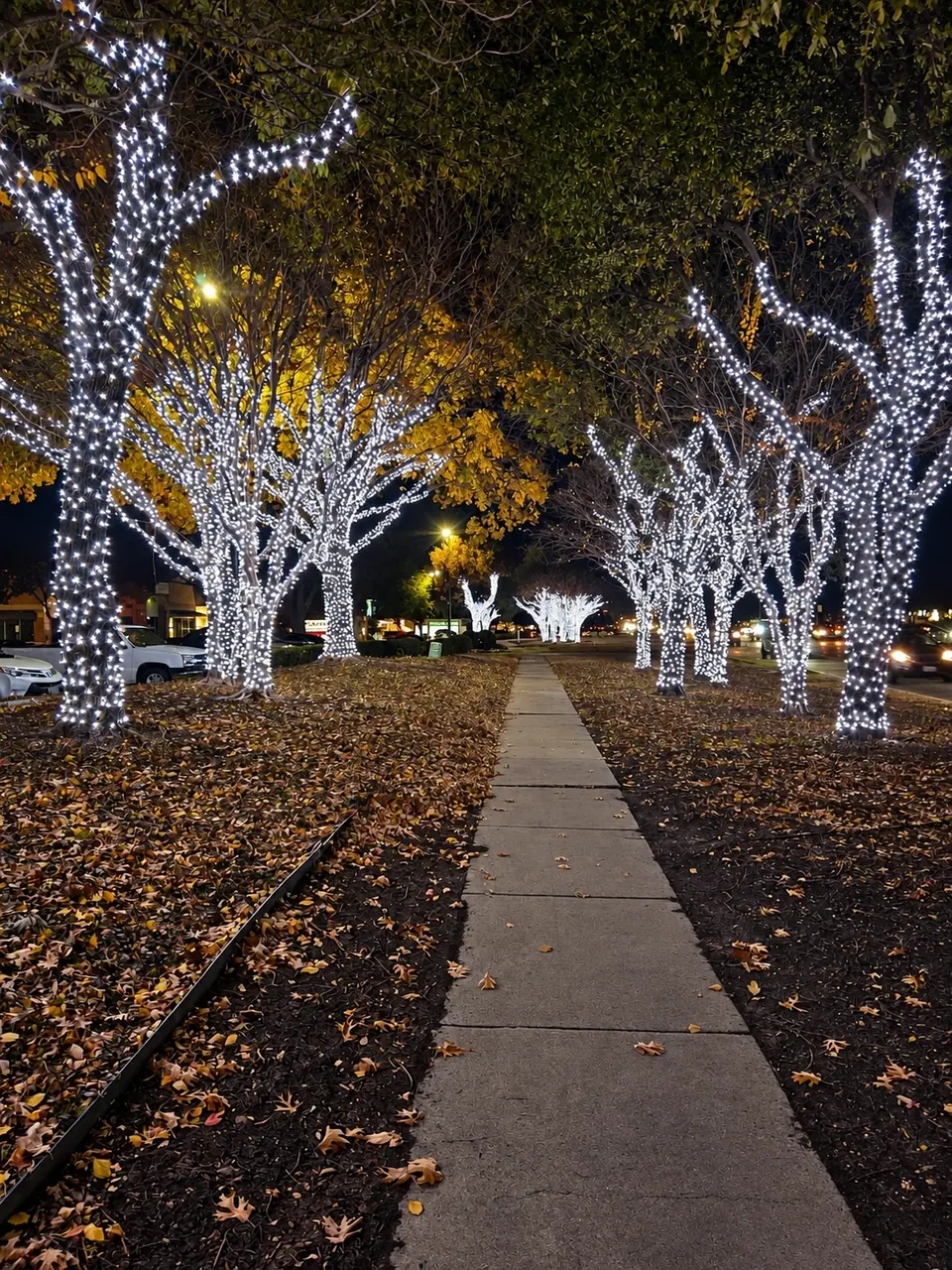
Those two tree photos come from different properties, shot at different times with different exposure and different surroundings. They’re good for pointing at a preference (“I like the golden one” or “I want the icy one”) but they aren’t a matched product test, and your phone screen shifts the colors again. Use them to describe what you want, not to judge an exact shade.
Where warm white earns its place
Warm white flatters brick, stone, and wood. The golden tone picks up the reds and tans in masonry instead of fighting them, and it sits comfortably next to the warm bulbs most homeowners already have in their porch and garage fixtures. The result is a display that looks like it belongs to the house rather than something clipped onto it.
It also tends to read as softer from the street. If you picture your holiday lighting as inviting rather than dramatic, warm white is the safer starting point.
One thing to separate in your own mind: color and coverage are two different choices. If the warm-tree example above appeals to you, ask yourself whether it’s the golden tone, the wrapped trunks and branches, or both. You can have warm light with a light touch, or cool light wrapped densely. Naming which part you like keeps the conversation with your installer clear.
Where cool white earns its place
Cool white creates contrast. Against dark shingles, dark trim, or a night sky, it draws a clean, precise line along a roofline. On trees it leans icy, which some people love for a wintry look even in a Texas December.
The tradeoff shows up when cool white meets warm fixtures. A cool roofline over a warm porch light can look intentional, like a frosted edge above a cozy entry, or it can look like two things that don’t agree. Neither is wrong. Just decide which one you’re going for before installation instead of discovering it on the first night.
Deciding between the two
| Question to ask | Warm white | Cool white |
|---|---|---|
| What does it look like from the street? | Golden, soft, blends with the house | Crisp, icy, outlines the house |
| How does it play with porch lights that stay on? | Blends with typical warm fixtures | Contrasts with them; decide if that’s the goal |
| How does it read against brick or stone? | Picks up warm tones in the masonry | Stands apart from the masonry |
| What still needs confirming? | The actual product on each feature, and which existing lights stay on | Same |
The last row matters most. Whichever column you pick, walk outside after dark with your normal exterior lights on and look at the whole front of the house. That’s the scene your Christmas lights will join.
Roofline bulbs and tree strings aren’t always the same light
We use commercial-grade C9 bulbs for holiday lighting. Roofline and tree lighting can involve different products, and a white from one line doesn’t automatically match a white from another.
That’s not a problem if you plan for it. Ask which light will go on each feature and whether they’re meant to match. If you’re combining a roofline with wrapped trees or a lit entry, one question up front saves a mismatch you’d otherwise live with for the season.
Prefer color instead?
White isn’t the only good answer. Red and white, red and green, or a defined multicolor mix all work on North Texas homes, and they sidestep the warm-versus-cool question entirely.
If you go this direction, specify the repeat, not just the colors. Red-white-red-white alternating every bulb looks different from two reds followed by two whites, and both look different from a random mix. Keep the pattern consistent across features you want to read as one design, such as the roof edge and the garage.
The roofline planning guide walks through how to describe roof edges, ridges, windows, entrances, and path lighting separately so nothing gets assumed.
Make your reference photos do real work
Pick two or three images from our project gallery and say what you like about each. “I like this one” tells us very little. “I like the golden tone but I don’t want the trees wrapped that heavily” tells us exactly what to quote.
Wide shots are more useful than close-ups. A close-up of a bulb shows a bulb. A wide view shows how the lights relate to the roof, the porch, the landscaping, and the dark spaces in between, which is the whole point.
Try a concept on your own house
Our free AI Design Tool lets you upload a photo of your home and explore colors and placement. It’s a handy way to test whether you lean warm, cool, or colorful before you talk to anyone.
Treat the result as a sketch, though. The tool’s color, brightness, spacing, and placement can differ from the finished installation, and it isn’t a measured plan or a color-accurate sample of any product. It’s for starting the conversation, not ending it.
Write down one clear selection
Before you request a quote, you should be able to state all of this in a few lines:
- The primary white (warm or cool) or the color palette
- The color and repeating pattern for each feature: roofline, trees, entry, windows
- Which permanent exterior lights will stay on during the season
- Two or three reference photos and the specific part of each you like
Then make sure the installation plan names the actual lighting selection for each feature. That written confirmation is what turns “white lights” into the display you pictured.
Ready to pick?
Our Christmas lighting service page covers what the install, seasonal maintenance, and takedown look like, and the booking guide explains why October is generally a good time for a first booking. When you’re ready, request a free estimate or text (214) 557-7809 with your address, a photo of the front of your home, the look you’re leaning toward, and when you’d like it up. We’ll confirm availability for your property and take it from there.